CLIx Authoring Help
Getting Started as an Author
We suggest that you do some pre-work before you try to create your assessment - it will save you hours of time!
Navigation
Assessments are organized in catalogs, much like how on your computer, files are organized in folders. The catalogs are indicated by a folder icon and assessments are indicated by a document icon. The current catalog structure is static and you can not create new catalogs. Please contact technical support if you need a new catalog. In addition, you cannot create assessments in the home or root catalog. You must always navigate into a subject catalog to create an assessment.
| Catalogs | |
| Assessments |
You can navigate into and out of the catalogs to place your assessment in their correct location. Currently, the folders are organized by Subject -> Sub-subject (optional) -> Unit -> Lesson. For example, in the image below, the breadcrumbs show English -> Basic English -> Unit 1 -> Lesson 5 -> Activity 3.

To navigate back up the catalog structure, you can use your browser's Back button, or the breadcrumbs in the navigation bar. To return home or to the root catalog, you can click on the CLIx logo in the upper left corner of the screen.
Creating an Assessment
A assessment is a simply a container that holds a set of questions that will be presented to the student. The assessment can contain one question or multiple questions. The questions can be of any available question type and be created in any order. Every assessment needs a descriptive name or title.
To create a new assessment, first navigate to the desired catalog in the UI. Remember, you cannot create assessments in the home or root catalog. You must always navigate into a content catalog to create an assessment.
To create a new assessment in the current catalog, click the New button on the upper-right of the screen.
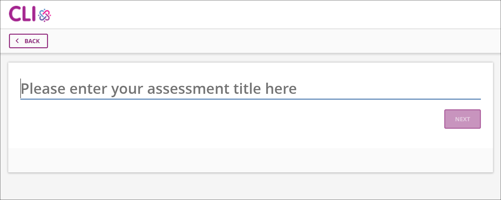
Enter a title for your assessment. You can edit this later, but it is what will show up in the list-view screen, so make sure that the title is specific to the content (i.e. Quiz 1 on animal types would be better than My assessment). Note that all instructors will see the same list of assessments.
Click the Next button to create the assessment and start adding questions.
Assessment Options
Every assessment has two options that you can set, N of M and Unlock Previous. Assessment wide options show up below the title field.
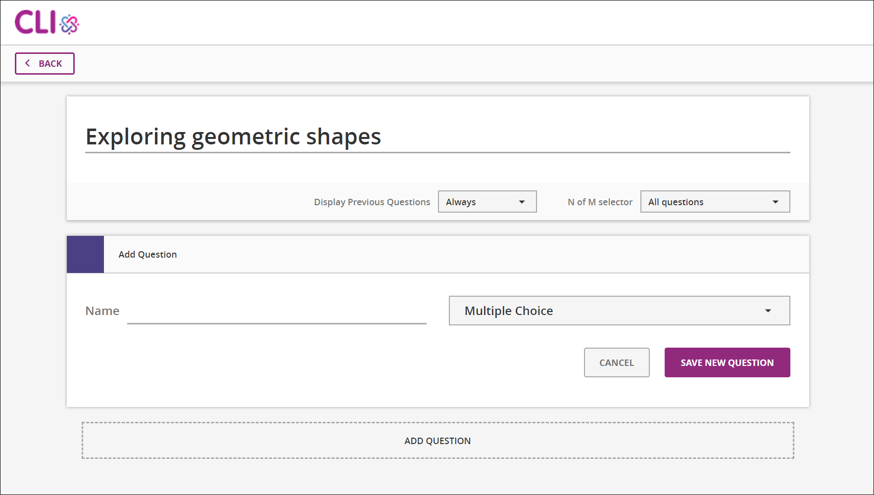
The N of M option controls how many questions the students must answer correctly for the given assessment. By default, students are required to answer all questions to complete the assessment. If you set N of M to any number other than all the questions, students will be able to click on the Next and Previous buttons to select which questions they want answer. For example: If the assessment had 4 short answer questions and you wanted the students to answer any 2 of the 4 questions, you would set the N of M option to 2. Students will then be able to use the Previous and Next buttons to read each a the questions before determining which questions they will answer.
Students will see an N of M heading that indicates how many questions they need to answer, and how many they have already completed.
The Display Previous Questions option allows the author to determine if the Previous button will be available to the students during this assessment. The Display Previous Questions option can be set to never, which means that for non-N of M questions, the students will only see the Next button and will not be able to return to previous questions. When this option is set to always, students can skip around the assessment and answer the questions in any order.
Once the assessment has been created, you can add your questions. For detailed information about the options for each question type, please see this other section about authoring question types.
Assessment Actions
From the list of assessments and catalogs, you will notice several different icons associated with each assessment. Let's explore what we can do with your assessment.

The first item is the assessment title. This is how you will identify and locate your assessment and why it's important to give each assessment a meaningful name. The assessment title can be edited and changed from the edit page.
The edit icon is only enabled (a purple color) when the assessment is unpublished. Clicking on it lets you edit the assessment and its questions. When the assessment is published, the edit icon will be disabled / grayed out. It will be unclickable.
The preview icon is only enabled (a purple color) when the assessment is published. Clicking on it lets you preview the assessment and interact with its questions. When the assessment is unpublished, the preview icon will be disabled / grayed out. It will be unclickable.
Deleting an assessment is permanent. You will get an alert confirming that you want to delete the assessment, when you click this button. You can not delete an assessment if it is published. In this case, the delete icon will be disabled / grayed out. It will be unclickable.
Currently, deleting an assessment does not delete the individual questions; however, currently there is no "search and add existing questions" interface, you cannot find old questions and re-use them. So, deleting an assessment effectively removes the questions from your access.
Published status. Located in the middle of the row in a column labeled Published, these icons indicate the published / unpublished state of the assessment. When the icon appears as a green cloud with a checkmark in it, that means the assessment has already been published, so clicking on the icon will take you to the assessment preview. If the icon is a purple cloud with an up arrow in it, then the assessment is unpublished, and clicking on the icon takes you to the edit assessment page.
While this icon is used to indicate the published / unpublished state of the assessment, it is also a toggle button you can use to change the published state. If the assessment is currently published, clicking on the icon will convert the assessment to an unpublished state, meaning that you can edit the assessment. If the assessment is currently unpublished, you can publish it by clicking on the icon, which means that you can then preview the assessment / generate an embed code for your students.
More details about publishing / unpublishing and the process are provided in the publish / unpublish section.
The embed code button only appears when the assessment is published. The embed code button generates an
iframeembed code that you can copy and paste and put into your gStudio activity. You can copy this code by clicking thecopyicon, or manually via the keyboard shortcutcontrol-c. Once you paste it (control-v) in gStudio, students will then be able to take the assessment in the gStudio activity.
Authoring Question Types
Common / Shared Question Fields and Options
Some of the question fields are shared across all or multiple question types, so we will describe them here. Typically how to specify the "correct answer" and how to populate the feedback fields are what differentiate the different types of questions, and will be described later in this document.
Shared Across All Question Types
Actions
On the top-right of each question, you'll see four icons for preview, move, delete, and help:
Preview
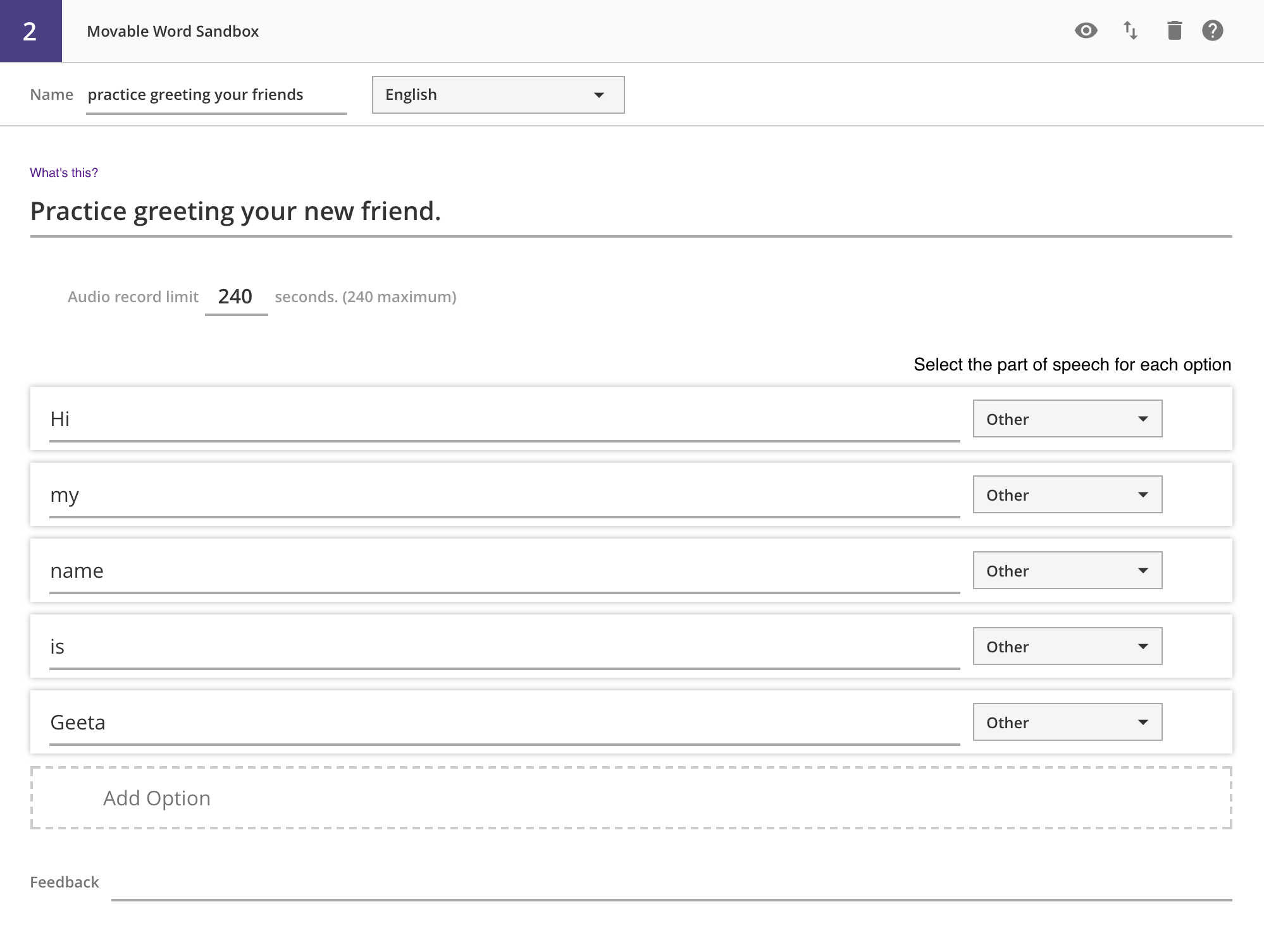
When clicking the preview icon, you will see how the question stem and options would render for the student, though you will not be able to interact with the question. For example, for Movable Words -- Fill in the Blank, the preview will turn the authoring UI:
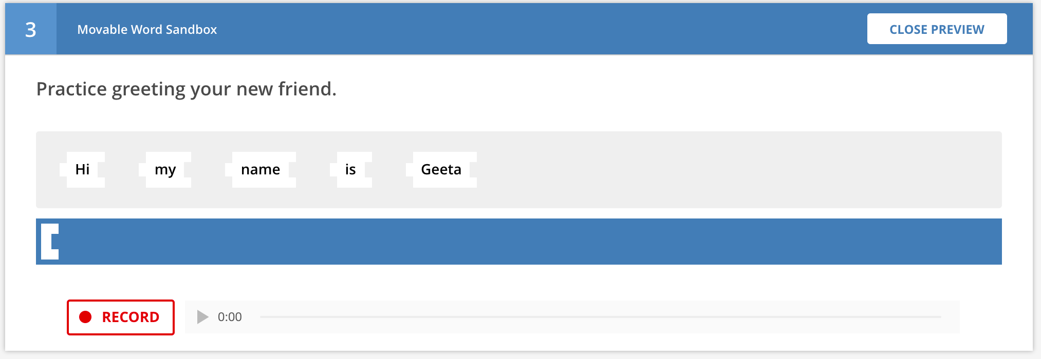
Into this:
Clicking the "Close Preview" button returns you to authoring view.
Move
For students, questions will appear in the order that they appear in the assessment authoring page. To change the order of questions, authors need to use this move button. Clicking move changes the question header and shows three options: Move up, Move down, and Close.
Clicking the move up arrow will swap the current question with the previous one. Clicking the move down arrow will swap the current question with the next one, and clicking close will keep the question in the same location and return the user to the normal question header.
Delete
This permanently deletes the question from the assessment and the system -- there is no way to recover the question. An alert window will appear, confirming that you wish to permanently delete the question.
Subsequent questions are moved up in terms of sequence order.
Help
This opens up the help page for the specific question type, in a new tab.
The user can manually navigate back to the authoring tab or close the help tab at any time.
Input Fields
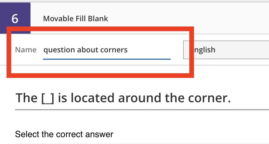
Question Name
This field is used to help identify the question. Currently it is not shown anywhere other than when editing the question, but should be populated with a name that will help you easily identify the question (i.e. Forces on a ball rolling down ramp would be better than Question 1). Future iterations of this tool may allow authors to search the question bank, and this name will be helpful in finding the question.
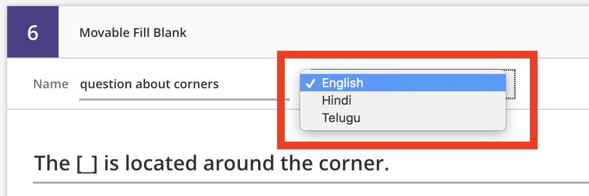
Language
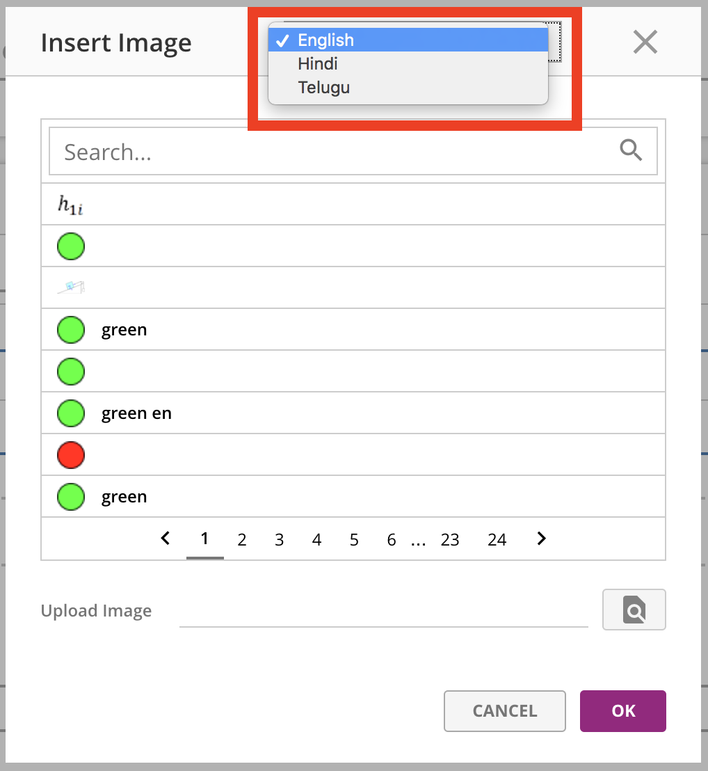
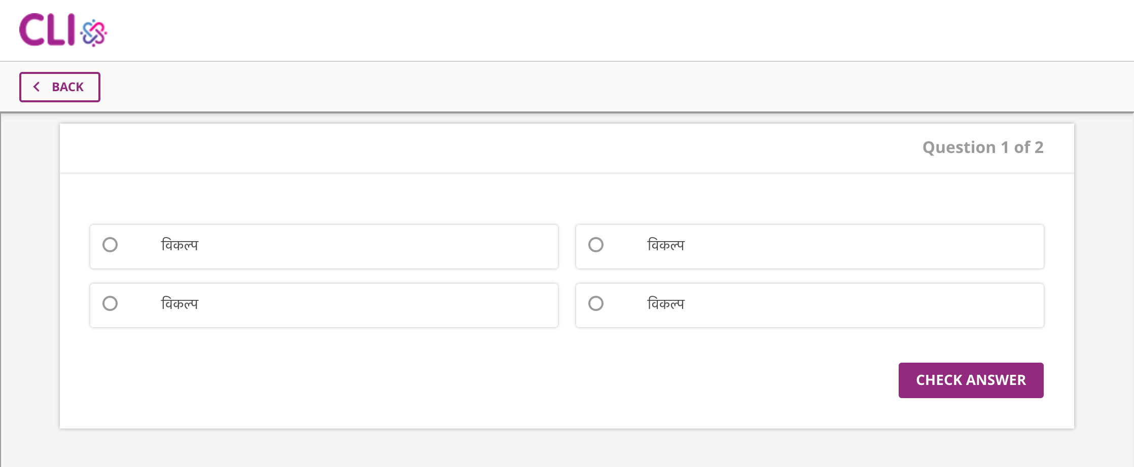
For all the text in a question, we support three languages: English (default), Hindi, and Telugu. Selecting a different language in this menu causes all the language fields for the question to "reset", allowing authors to input translations for each text field.
NOTE: Because all the text is reset when the language setting changes, images and media files will also need to be uploaded for each language.
Question Text
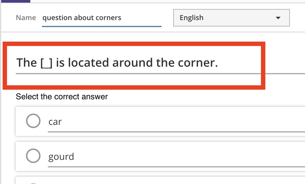
All question types have a question stem or prompt that is shown to students, for example "What is the color of the sky?". This field supports basic text formatting and image / audio / video upload.
For Movable Words -- Fill in the Blank questions, you need to make sure that you include one (and only one) [ _ ] in the question text, to indicate where the blank should go, otherwise this question will break and the assessment will not render for students. Make sure that no punctuation is next to the [ _ ] (or include a space: [ _ ] . works, but [ _ ]. breaks). For example: The sky is [ _ ] .. We currently do not support more than one blank space.
Text Fields and Media
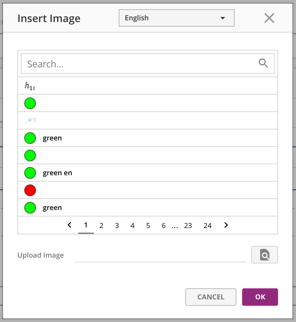
All text fields that use this editor allow you to upload image / audio / video media:
This means that for the question text (non-fill-in-the-blank), options (non-fill-in-the-blank), or feedback, you can include media elements.
A modal will appear, allowing you to select from an existing media asset of the same type, or uploading a new one.
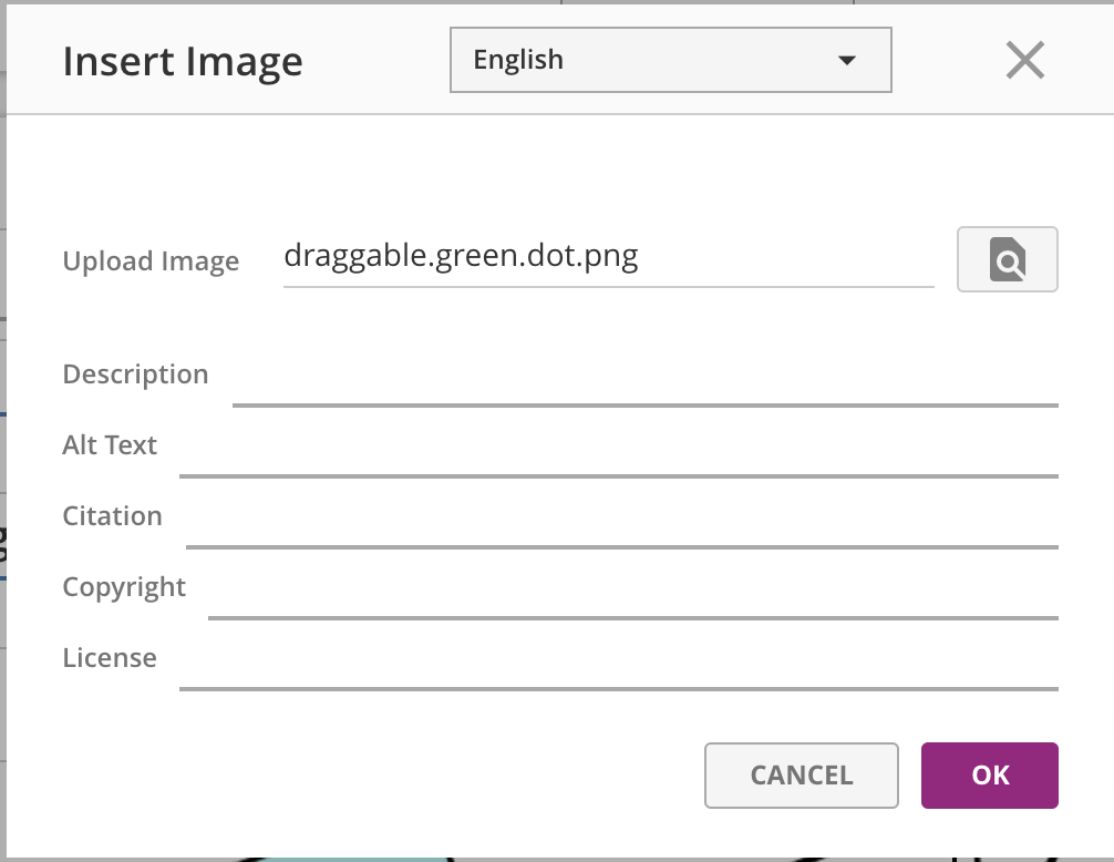
When uploading images, audio, or video, you should also include all of the metadata fields, like alt-text, descriptions, transcript files, and caption files, so the media is accessible for all your students.
Make sure that you do not change the language setting at the upload modal -- by default, it should come up as the same language the question language dropdown is set to. Changing that value will mean the data you provide will not save to the right spot in the database, and it will not appear correctly for students.
Shared Options for Multiple Choice & Reflection Questions
There are a set of three option checkboxes for the multiple choice and reflection questions.
Maintain Choice Order
When this box is checked, all students see the choice order in the order that they are authored. When this box is unchecked, each student will see the choices in a randomly shuffled order.
Multiple Answer
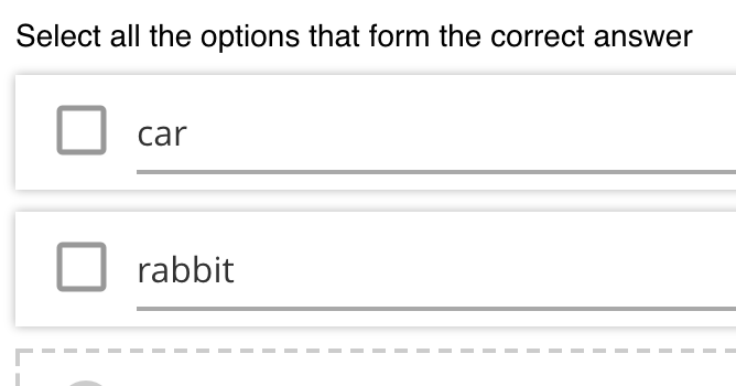
This checkbox is a shortcut for changing the question type between Multiple Choice and Multiple Choice -- Multiple Select (or Multiple Choice -- Reflection and Multiple Choice -- Multiple Select & Reflection). The single select question shows radio buttons next to each choice, and students can only select one of the given choices.
Multiple select questions show check boxes next to each choice, and students can select one or more of the given choices.
Reflection
This checkbox is a shortcut for changing the question type between Multiple Choice and Multiple Choice -- Reflection (or Multiple Choice -- Multiple Select and Multiple Choice -- Multiple Select & Reflection). The non-reflection questions need to have a specific right-answer specified while authoring, and provide both correct feedback and incorrect feedback (for each incorrect choice). All the reflection questions accept any response as a valid / correct response, and only provide a generic feedback on submission.
Audio Record
Description
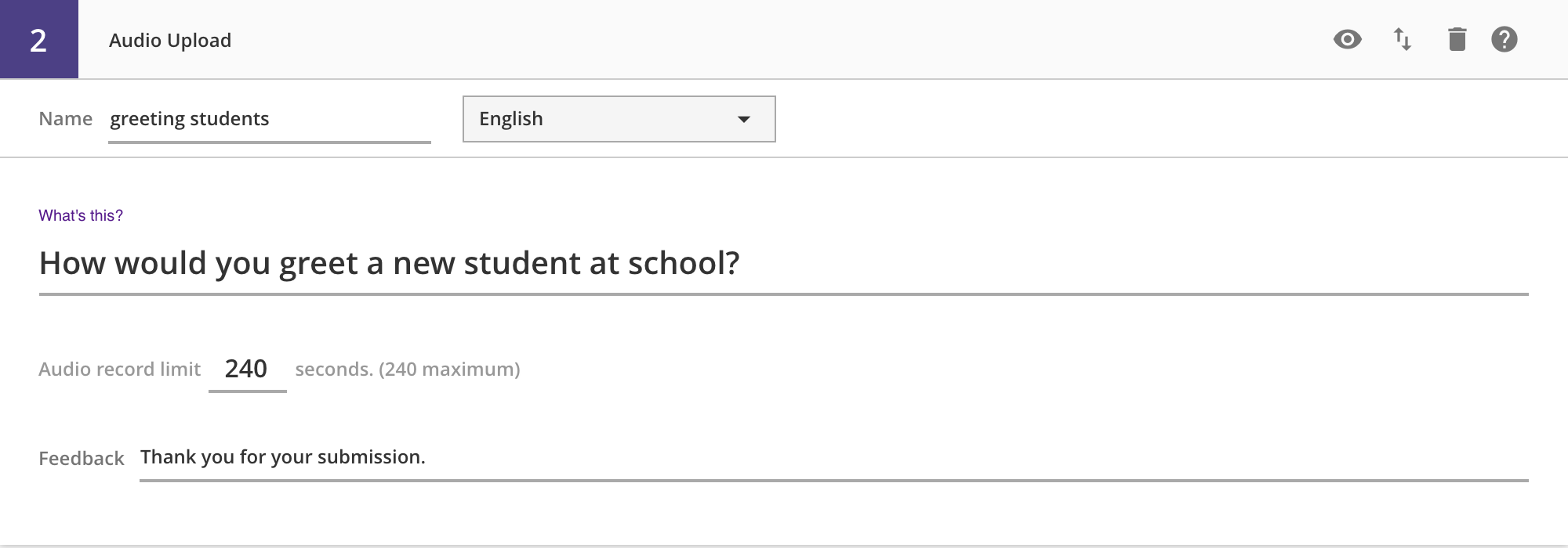
You will use this question when you want students to record their voices and submit a recording. Students can record and playback the audio as many times as they wish before submitting the final recording to the server. There is no way to "recover" previously recorded audio -- each recording over-writes previous recordings.
Author View
Student View
Other Authored Inputs
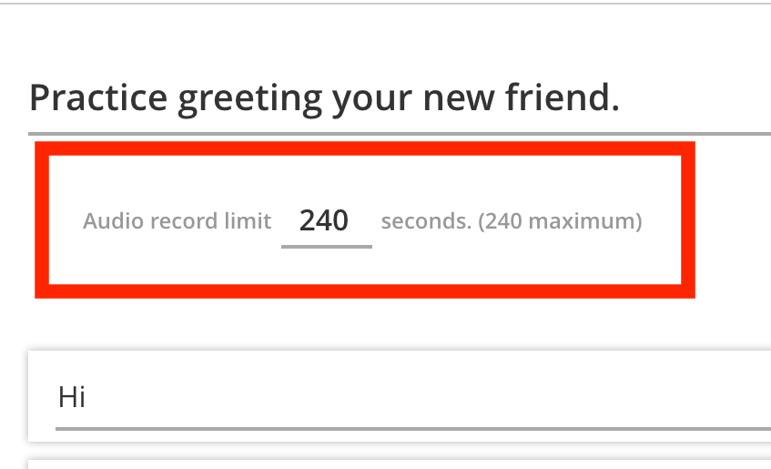
You can set the time-limit for the audio recording, to adjust to the expected length of audio. The default (and maximum allowable) is 240 seconds (4 minutes), and can be as low as 1 second (though this is unrealistic and will not capture any audio).
Indicating Correctness
Audio Record questions are always "correct", as long as the student submits an audio recording, so there is no need to indicate a specific "correct" answer.
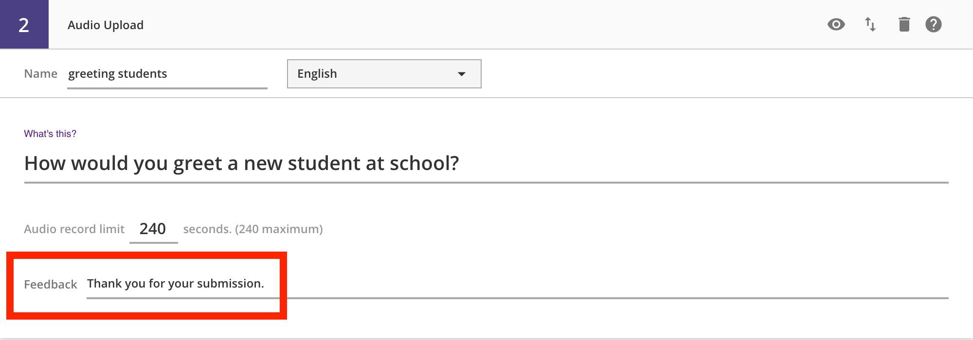
Providing Feedback
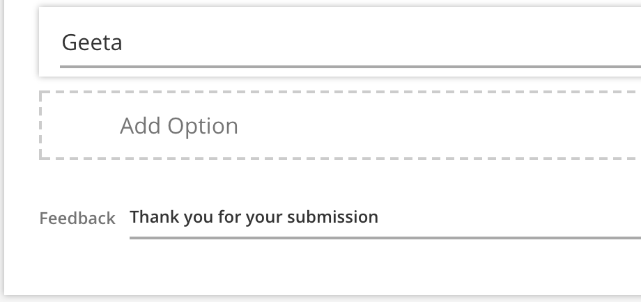
You can provide a feedback string that the student sees after submitting their audio recording.
Drag and Drop
Description
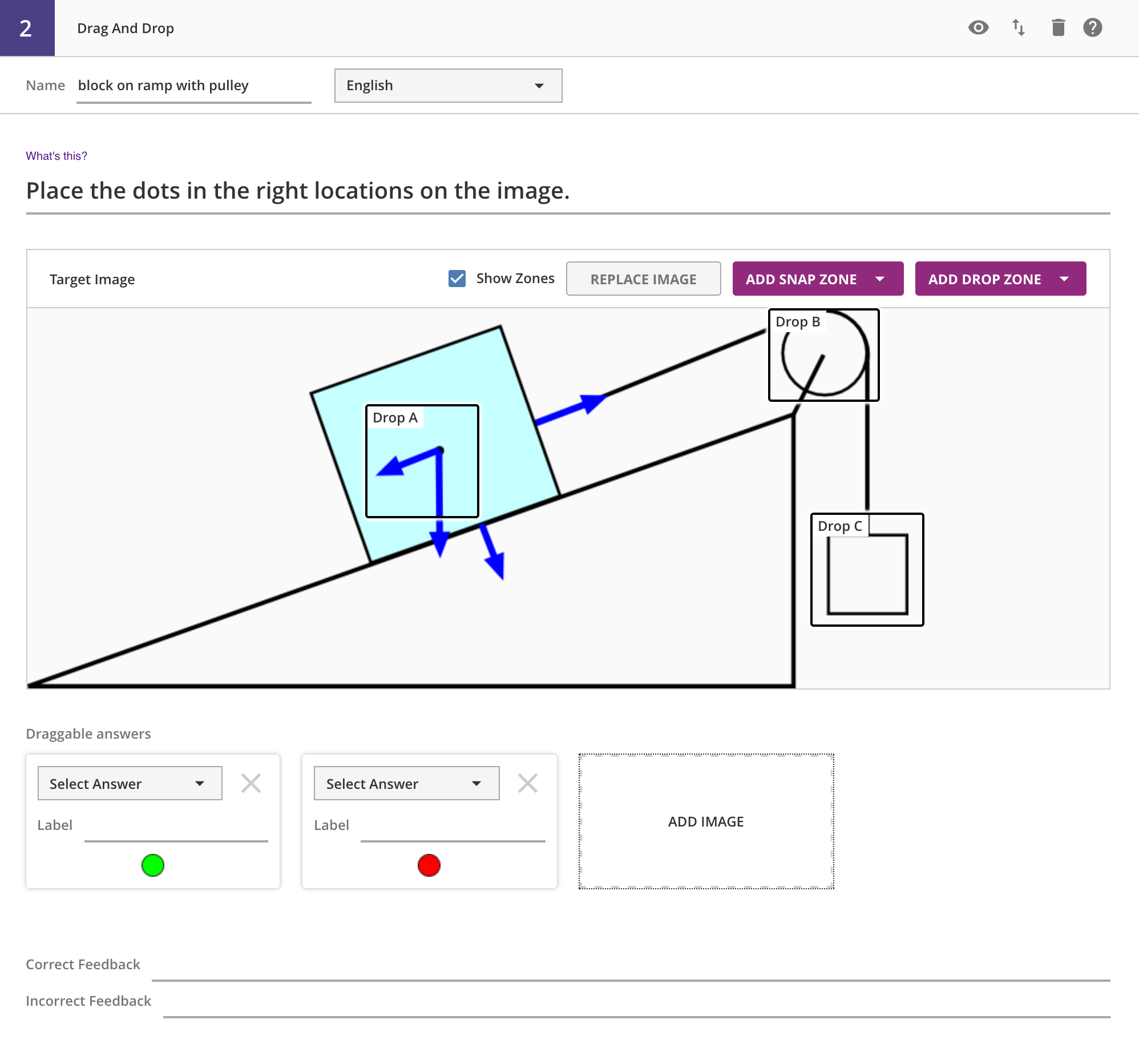
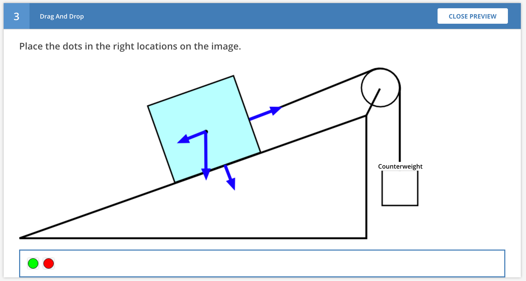
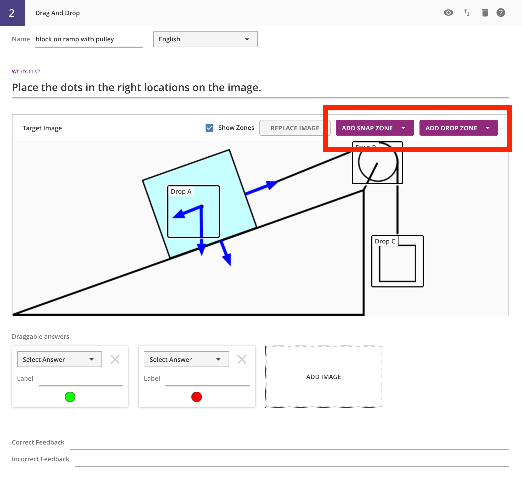
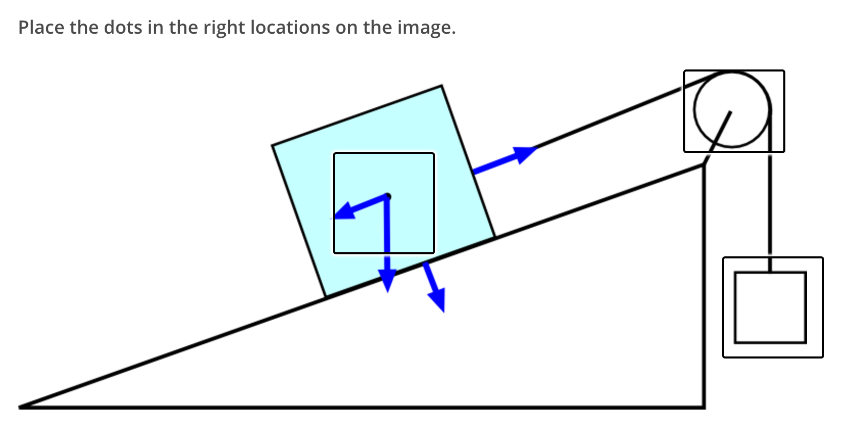
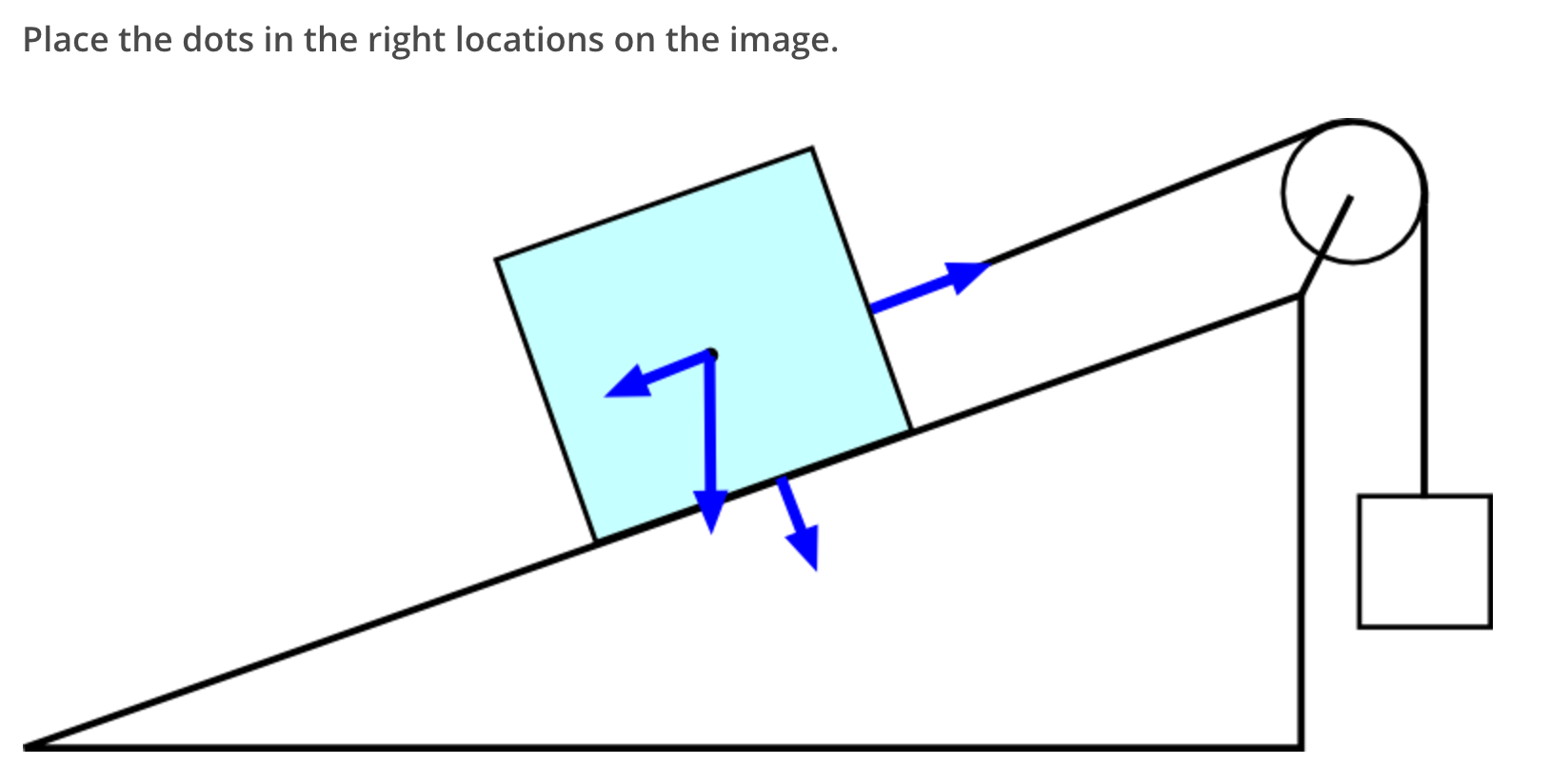
Drag and drop allows authors to define a background image, draggable answers, and drop zones. The idea is for students to drag the draggable answers and place them in the correct locations on top of the background image.
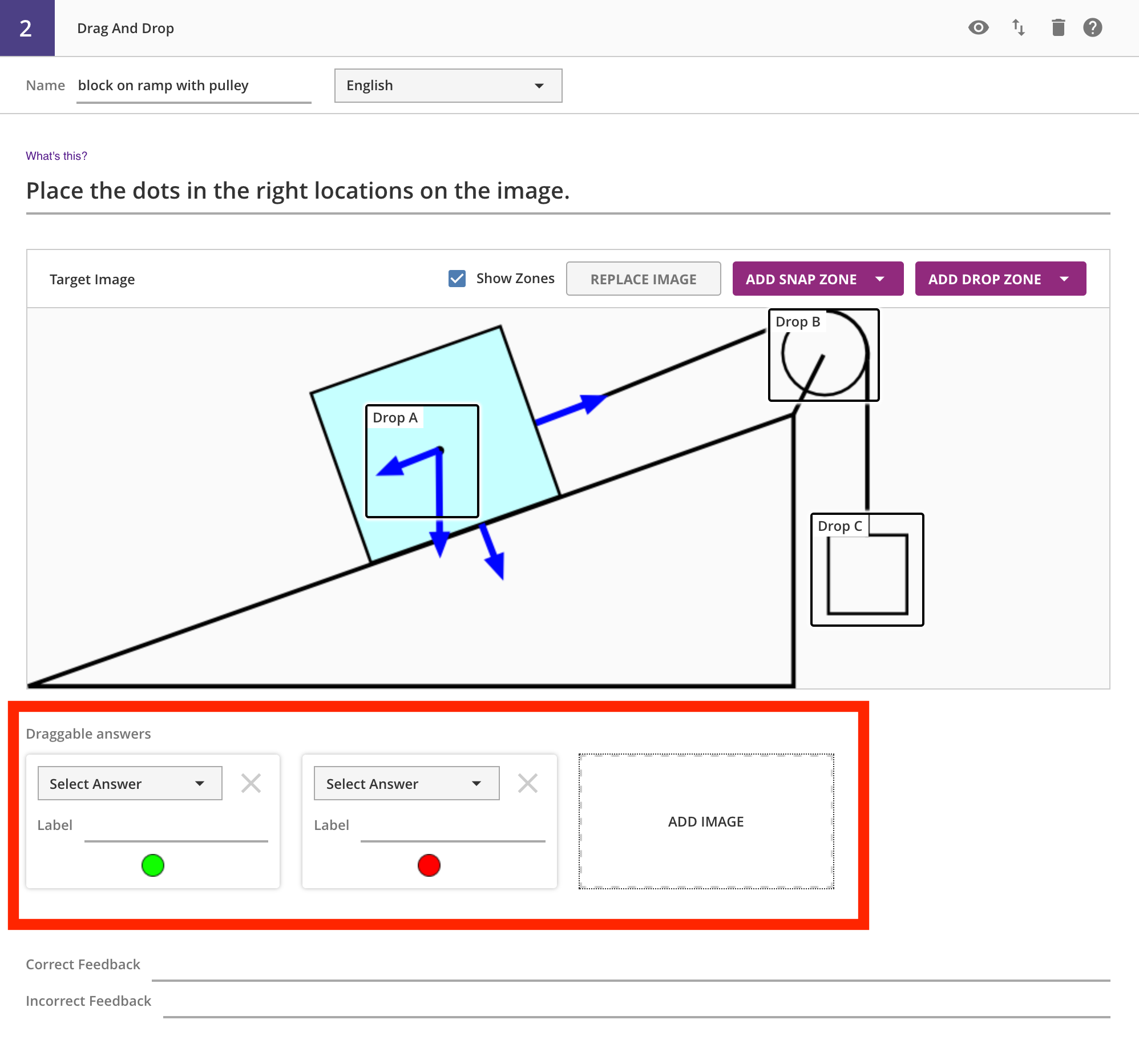
Author View
We also provide a video guide for authoring drag and drop questions below.
Student View
Other Authored Inputs
Target Image
The target image is the background upon which the zones and draggables will be placed. You must have one for this question type, and the dimensions must be <= 920x300px -- and the tool will preserve these, i.e. the image will not be scaled or resized when shown to students. So make sure to upload the image in the final resolution that you want students to see it.
Draggable Answers
These are the images that students will drag and drop onto the target image.
Zones
Zones are the regions on the target image that will accept the draggables. You should make sure that they do not overlap, otherwise the server will not be able to guarantee a correct evaluation of the response.
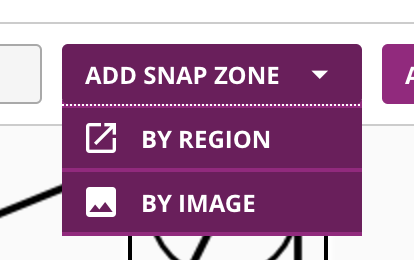
There are two types of zones, snap and drop. For snap zones, the draggable images will automatically snap to the center of each zone when placed inside the zone. For drop zones, the image will stay where it is placed, within the zone.
For each type of zone, you can create them by region (drawing freehand) or by uploading an image (the zone will be initially sized to match the image size). For both options, you can resize the zone after it is created, and move it around on the target image.
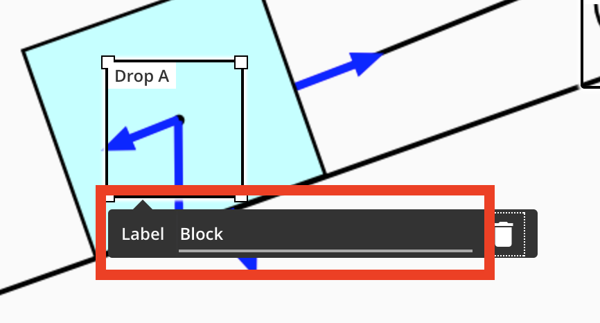
For accessibility, you should add a label to each zone that can be read out loud by a screenreader. To do this, click on the zone, and a tooltip should appear with a label field. Once you've typed into the label field, make sure you tab out to save your changes. Clicking elsewhere without tabbing out of the field causes the tooltip to disappear and not save your label text.
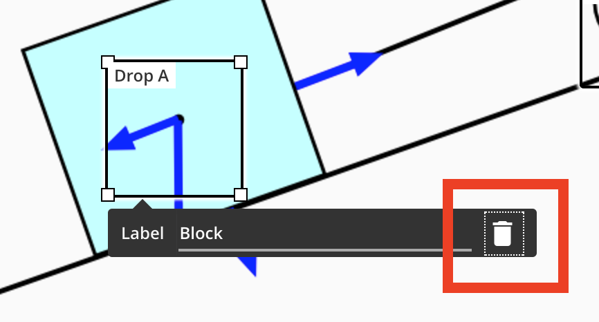
Do delete a zone, click on it, and then the trash can icon on the right of the tooltip.
Visibility
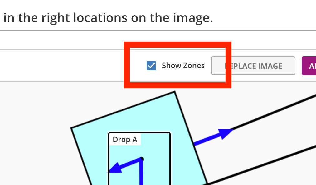
A check box is provided to either show or hide the zones for the student. Hiding the zones can make the question more challenging.
Indicating Correctness
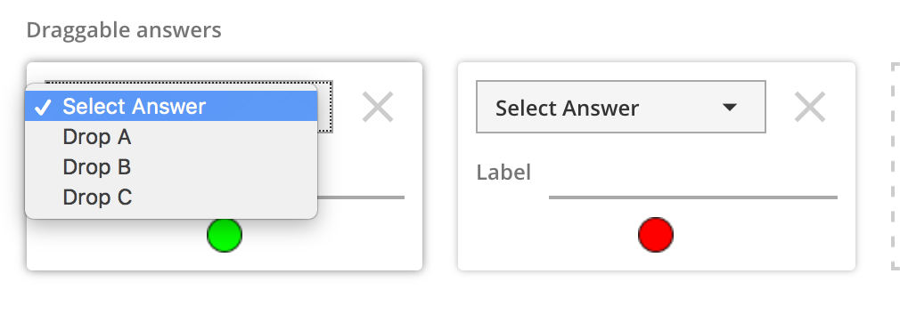
To indicate correctness, you need to select the matching zone for each droppable. Each zone has a label, like Zone A -- these appear in the dropdown list in each draggable. Picking the zone label indicates that the draggable needs to be dropped in that zone to be correct. Multiple draggables can be assigned to the same zone, and all the draggables must be in their correct zone for the entire answer to be correct. For draggables that are not part of the correctness calculation, you can leave the dropdown as Select Answer.
Providing Feedback
The bottom of the authoring view gives you input for the correct feedback and the incorrect feedback. The incorrect feedback will be shown to the student for every incorrect combination submitted as a response.
File Upload
Description
This question type is meant to be used mostly with other tools. For example, your students might create a model in Turtle Blocks, which they can submit as their solution to a File Upload question.
Author View
Student View
Other Authored Inputs
None
Indicating Correctness
File Upload questions are always "correct", as long as the student submits a file, so there is no need to indicate a specific "correct" answer.
Providing Feedback
You can provide a feedback string that the student sees after submitting their file.
Image Sequence
Description
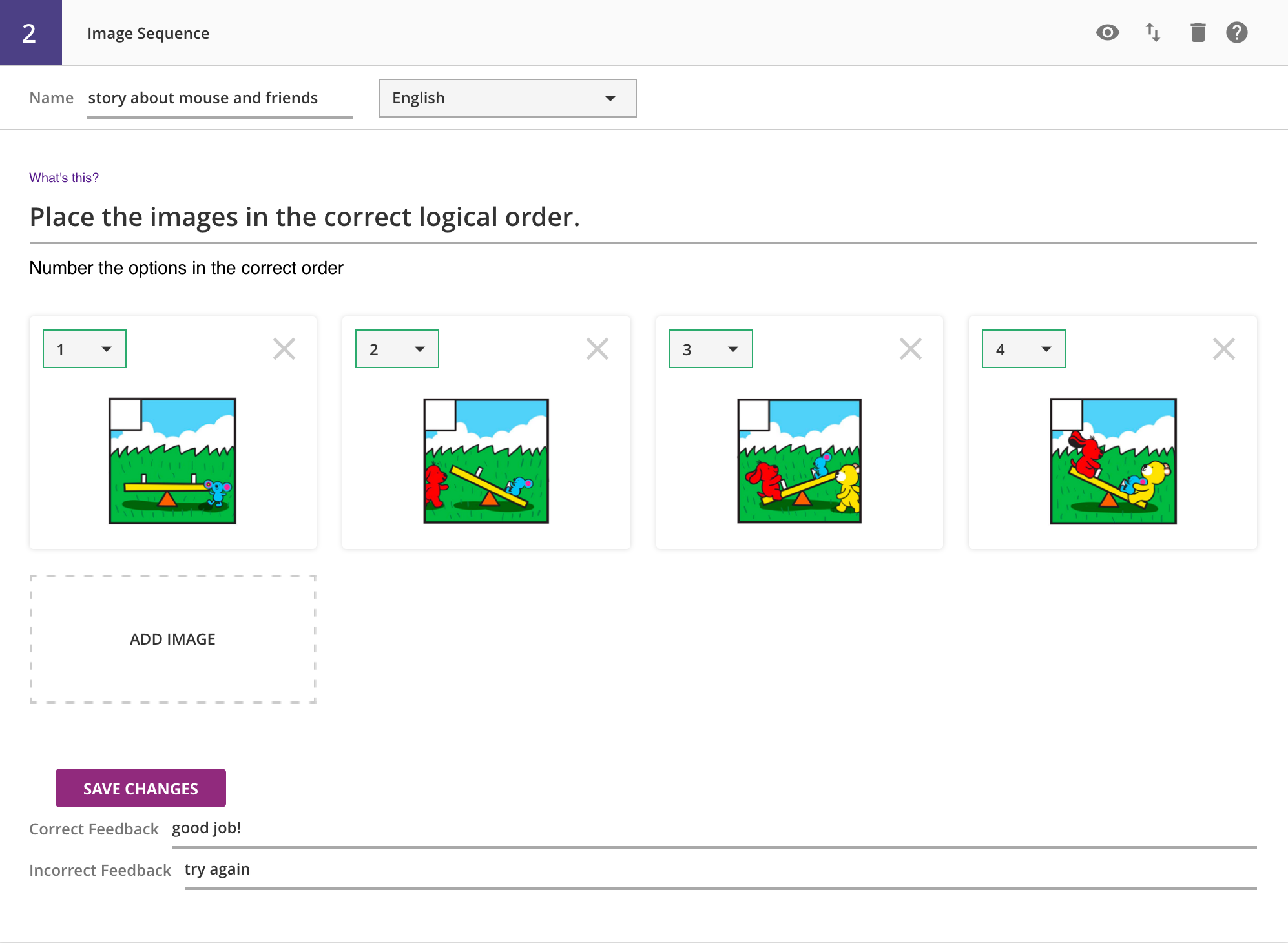
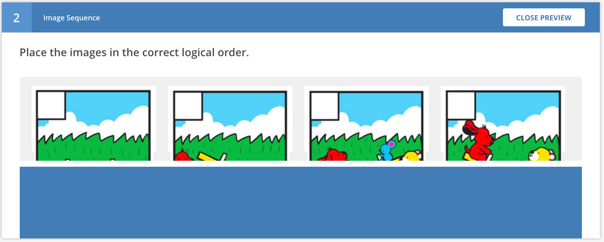
These questions involve the student placing a set of images into the correct order, typically so the story told by the images makes logical sense. The images are dragged down from a central "cloud" onto an answer bar, and they will snap together.
Author View
Student View
Other Authored Inputs
You will need to make sure your images are no more than 100px wide, before uploading them. The tool will not scale your images for you. Each image needs to be added, and then collectively they need to be assigned the "correct answer" order.
Note that adding a new option automatically adds the option to the question, but in order to save the image or sequence number, you need to click the Save Changes button.
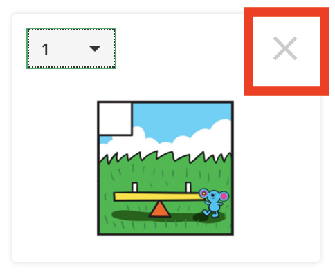
You can also delete the image with the X icon on the upper-right.
Indicating Correctness
Once the numbers are in the correct order, you need to click the Save Option Changes button. This saves the correct answer on the server.
Providing Feedback
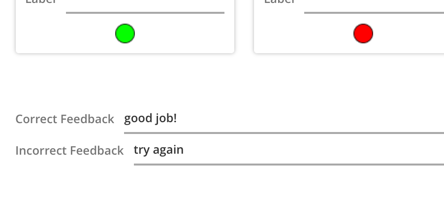
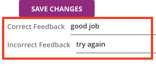
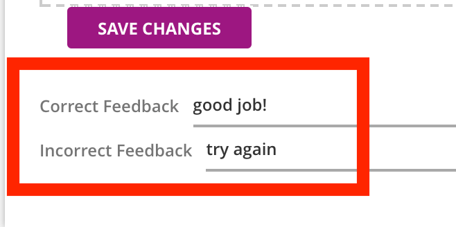
There are two fields for feedback, one for the correct answer, and another for all incorrect responses.
Movable Word -- Fill in the Blank
Description
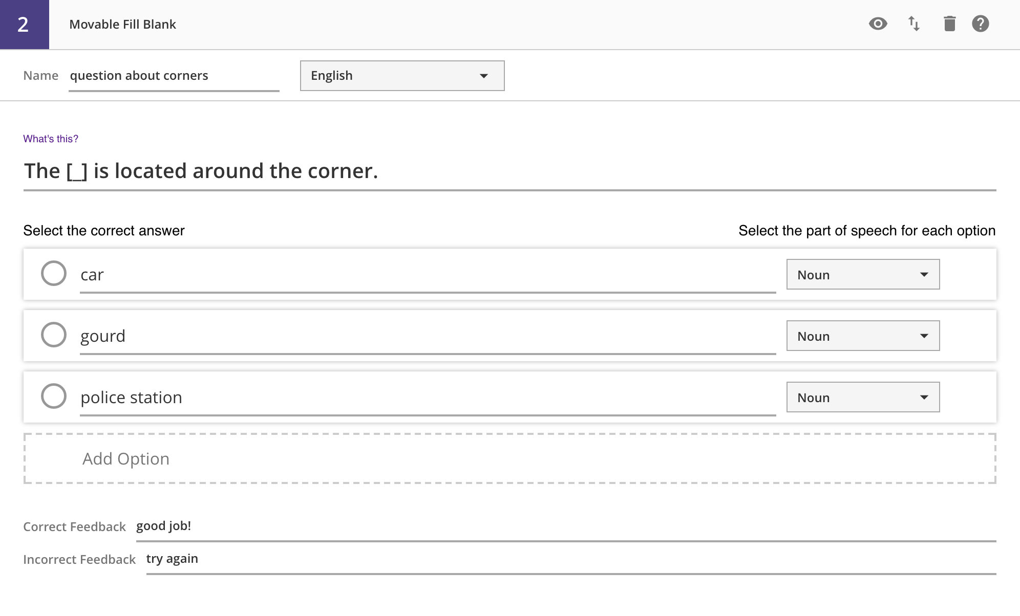
In this question type, students are presented with a word cloud and a sentence with a blank space in it (currently we only support one blank space). Students must drag the correct word from the cloud down into the space. They can drag the current word back and replace it with another one, as often as they want, before submitting.
Author View
Student View
Other Authored Inputs
Each word or phrase that you want to appear in the word cloud must be entered as a separate option.
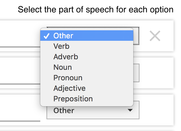
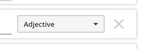
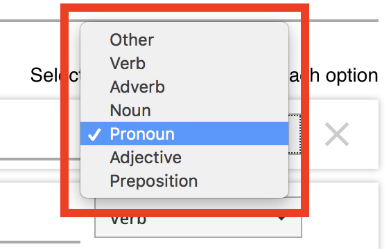
Each option has several controls inside. The radio button on the left indicates the correct option (more in the next section), and the dropdown menu on the right lets you select a word type for this option.
Each word type shows up as a different color when the question is rendered for the student.
You can also delete the option with the X icon on the right.
Indicating Correctness
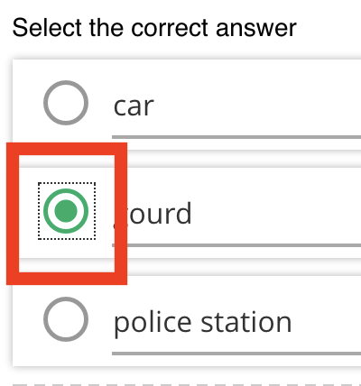
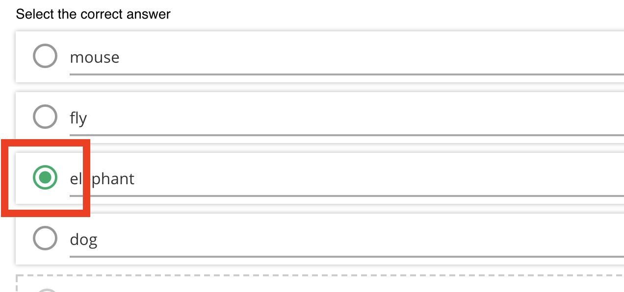
To indicate which of the word choices is the correct one, you need to select the radio button in that option. Doing so will turn it solid green.
Providing Feedback
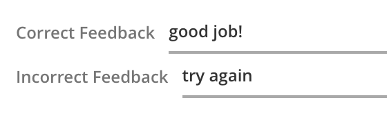
At the bottom of the question, there are two feedback fields. One is for the correct answer, and the other is provided for all incorrect responses.
Movable Word -- Sandbox
Description
This version of Movable Word is meant for the students to practice reading the words out loud. As in other versions, the words appear in a word cloud. Students can drag the words down to an answer region, where they will snap together. A recording tool is present to record the students speaking the sentence they formed; each recording overwrites previous recordings. To complete the question, students submit one of their audio recordings.
Author View
Student View
Other Authored Inputs
Each word or phrase that you want to appear in the word cloud must be entered as a separate option.
Each option has several controls inside. The dropdown menu on the right lets you select a word type for this option.
Each word type shows up as a different color when the question is rendered for the student.
You can also delete the option with the X icon on the right.
You can set the time-limit for the audio recording, to adjust to the expected length of audio. The default (and maximum allowable) is 240 seconds (4 minutes), and can be as low as 1 second (though this is unrealistic and will not capture any audio).
Indicating Correctness
All audio submissions are considered correct, so no special indicator is required.
Providing Feedback
A single feedback input allows authors to show students a message after submitting their audio recording.
Movable Word -- Sentence
Description
This version of Movable Word is an assessment tool for joining words or symbols, and student responses will be evaluated for correctness. As in other versions, the words appear in a word cloud. Students can drag the words down to an answer region, where they will snap together. Students can unsnap their current answer at any word in the chain, and start over. When they feel like they have constructed the entire word chain correctly, they can submit it.
Author View
Student View
Other Authored Inputs
Each word or phrase that you want to appear in the word cloud must be entered as a separate option.
Each option has several controls inside. On the left is a dropdown menu with a set of numbers, used to indicate correctness (see next section). The dropdown menu on the right lets you select a word type for this option.
Each word type shows up as a different color when the question is rendered for the student.
You can also delete the option with the X icon on the right.
Indicating Correctness
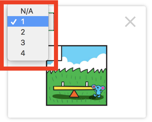
Correctness is evaluated as getting the words in the right order -- the order specified by the numbers on the left of each option box. Currently, all options must have a number associated with them, i.e. there can be no unused word choices. Leaving an option box at N/A means the authoring tool will automatically insert that option into the correct sequence.
Note that adding a new option automatically adds the option to the question, but in order to save the text, word type, or sequence number, you need to click the Save Changes button.
Providing Feedback
Two feedback fields at the bottom of the question allow you to enter a correct feedback response, or an incorrect feedback response (shown for all incorrect word combinations).
Multiple Choice -- Multiple Select
Description
This question type presents a set of choices to the student, and they have to select one or more as the correct answer.
Author View
Student View
Other Authored Inputs
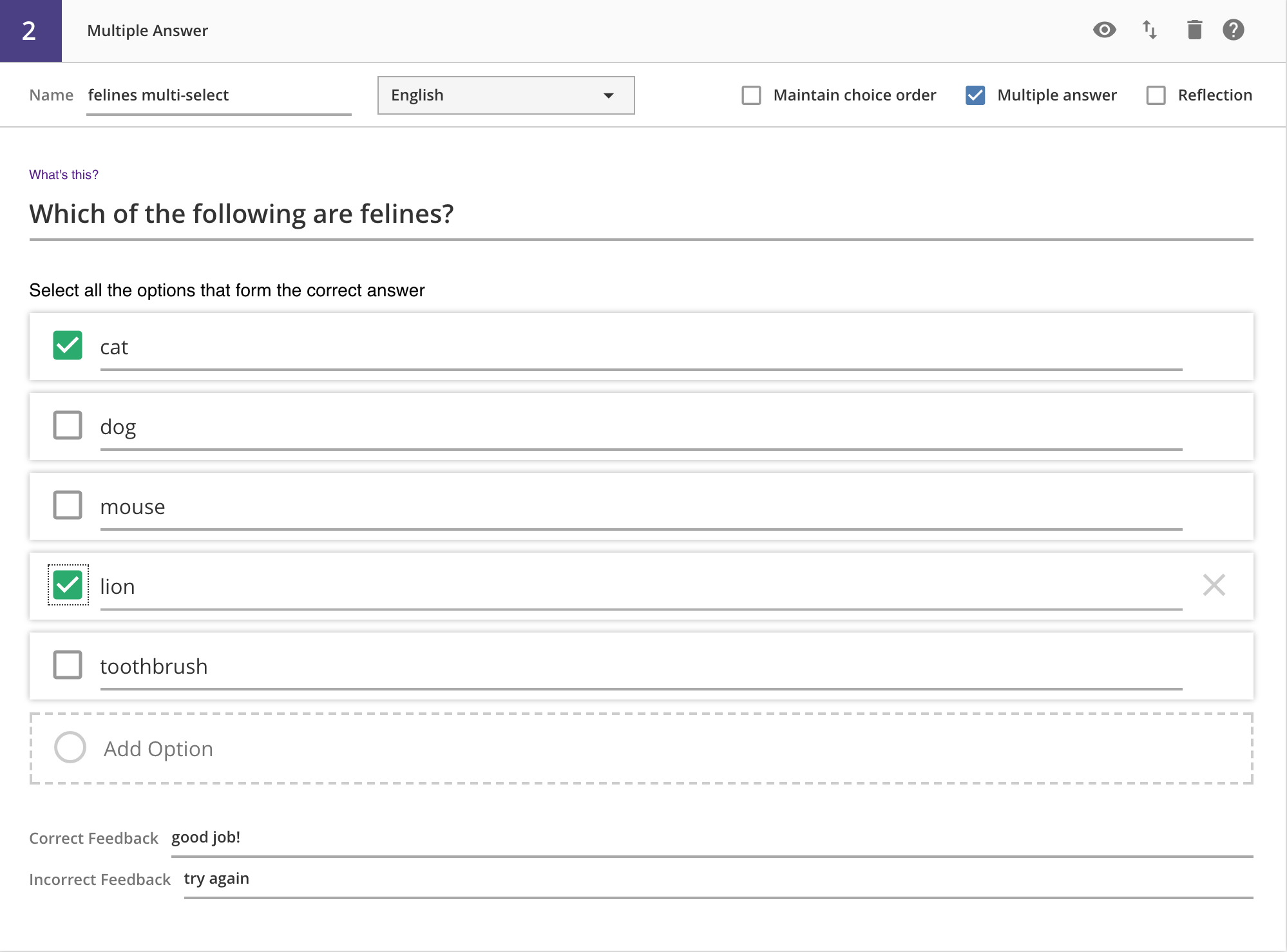
Each choice will appear as a separate option bar.
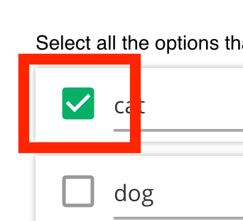
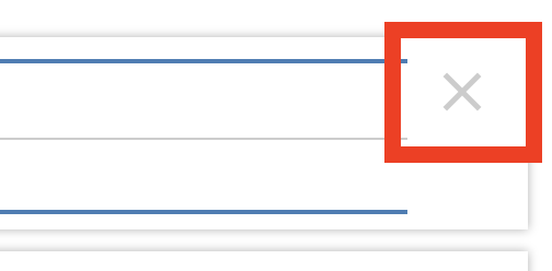
Each option has a checkbox on the left, used to indicate correctness (see next section). You can also delete the option with the X icon on the right.
Indicating Correctness
To indicate which set of choices is correct, you need to check the boxes on the left of each choice:
Students must select all of the same boxes that you check. A subset of the correct choices will be evaluated as incorrect, i.e. the checkboxes indicate AND, not OR (both a AND c are required to be correct, not either a OR c are correct).
Providing Feedback
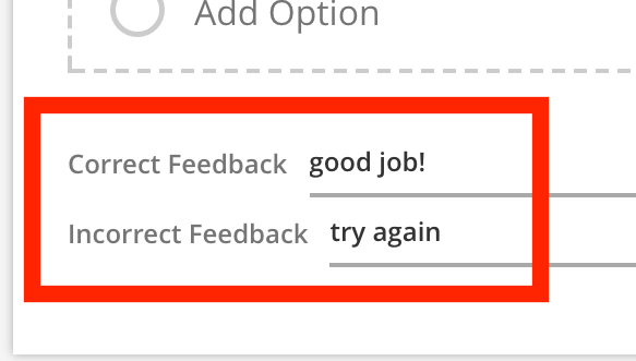
Two feedback fields are provided for you, one for the correct answer feedback, and the other for all incorrect responses.
Multiple Choice
Description
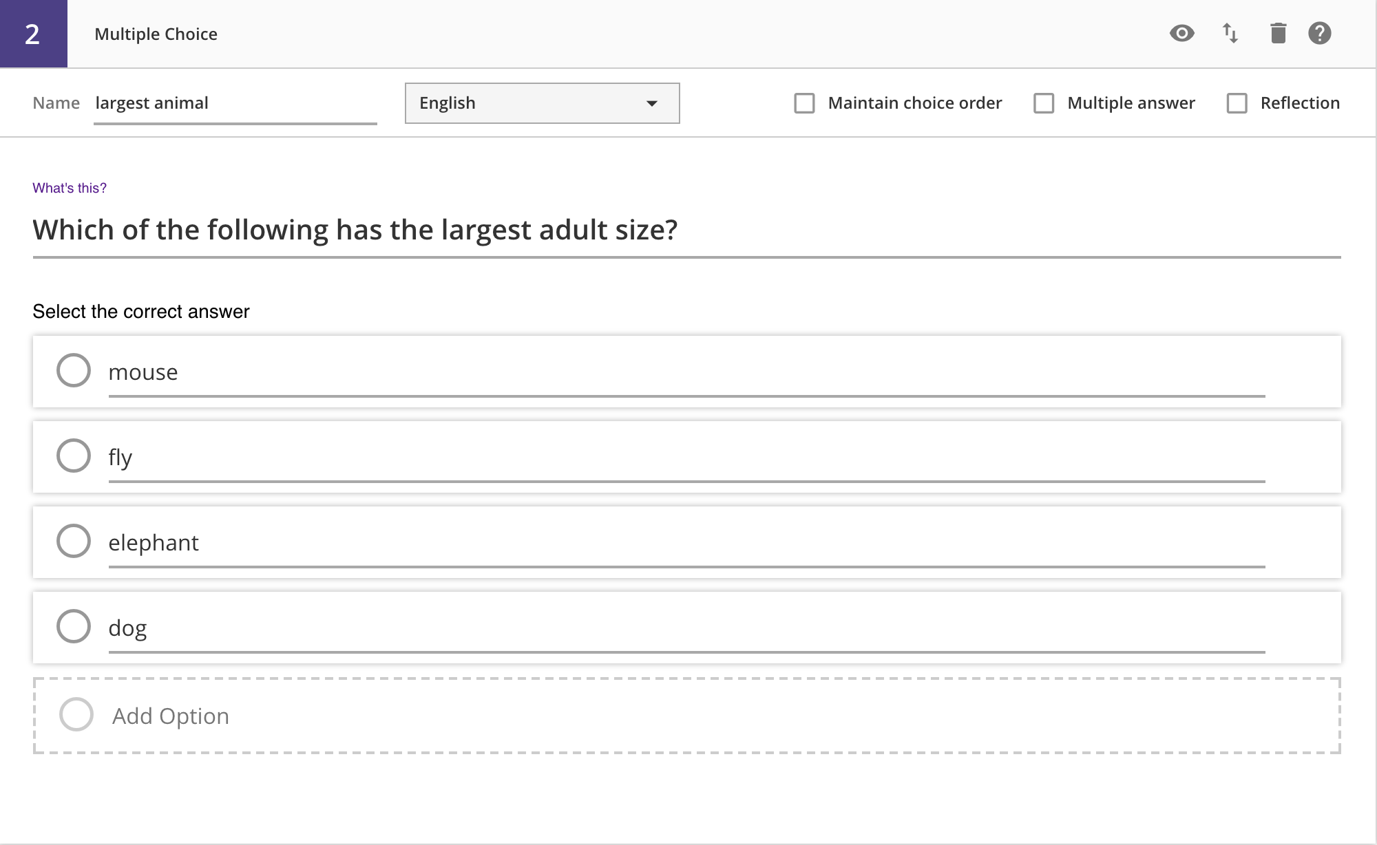
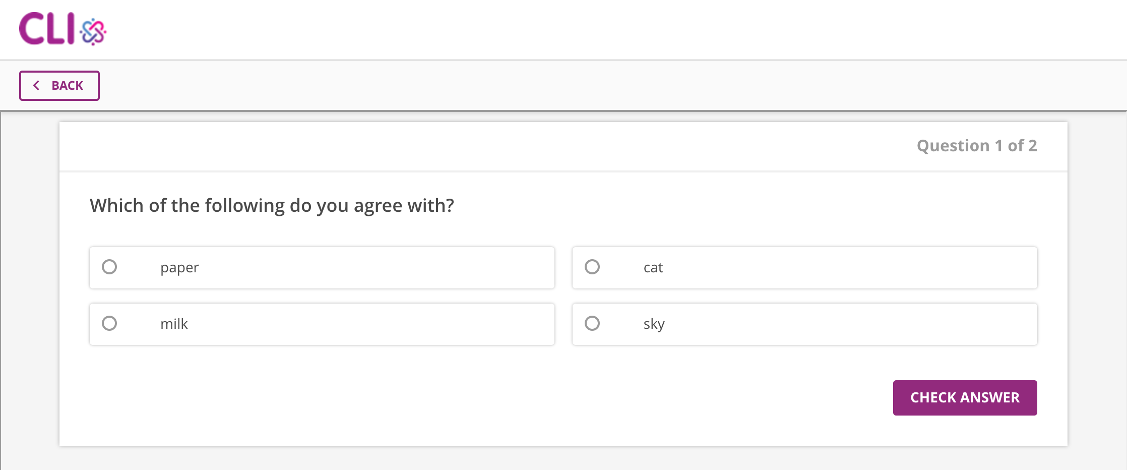
This question type presents a set of choices to the student, and they have to select one, and only one, as the correct answer.
Author View
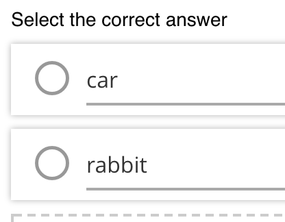
Student View
Other Authored Inputs
Each choice will appear as a separate option bar.
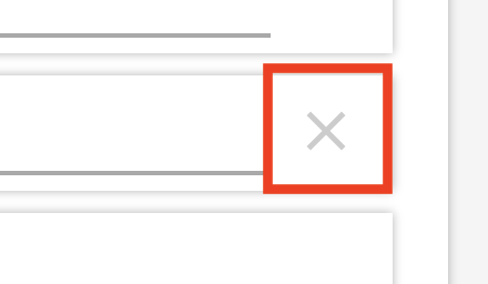
Each option has a radio button on the left, used to indicate correctness (see next section). You can also delete the option with the X icon on the right.
Indicating Correctness
To indicate which set of choices is correct, you need to check the radio button on the left of the correct choice:
Providing Feedback
For these questions, each choice has its own feedback field.
You can type in individual, per-choice feedback. The feedback associated with the submitted response will be returned and displayed to the student. This means that you can provide choice-specific incorrect feedback, which is unique to this question type.
Multiple Choice -- Multiple Select & Reflection
Description
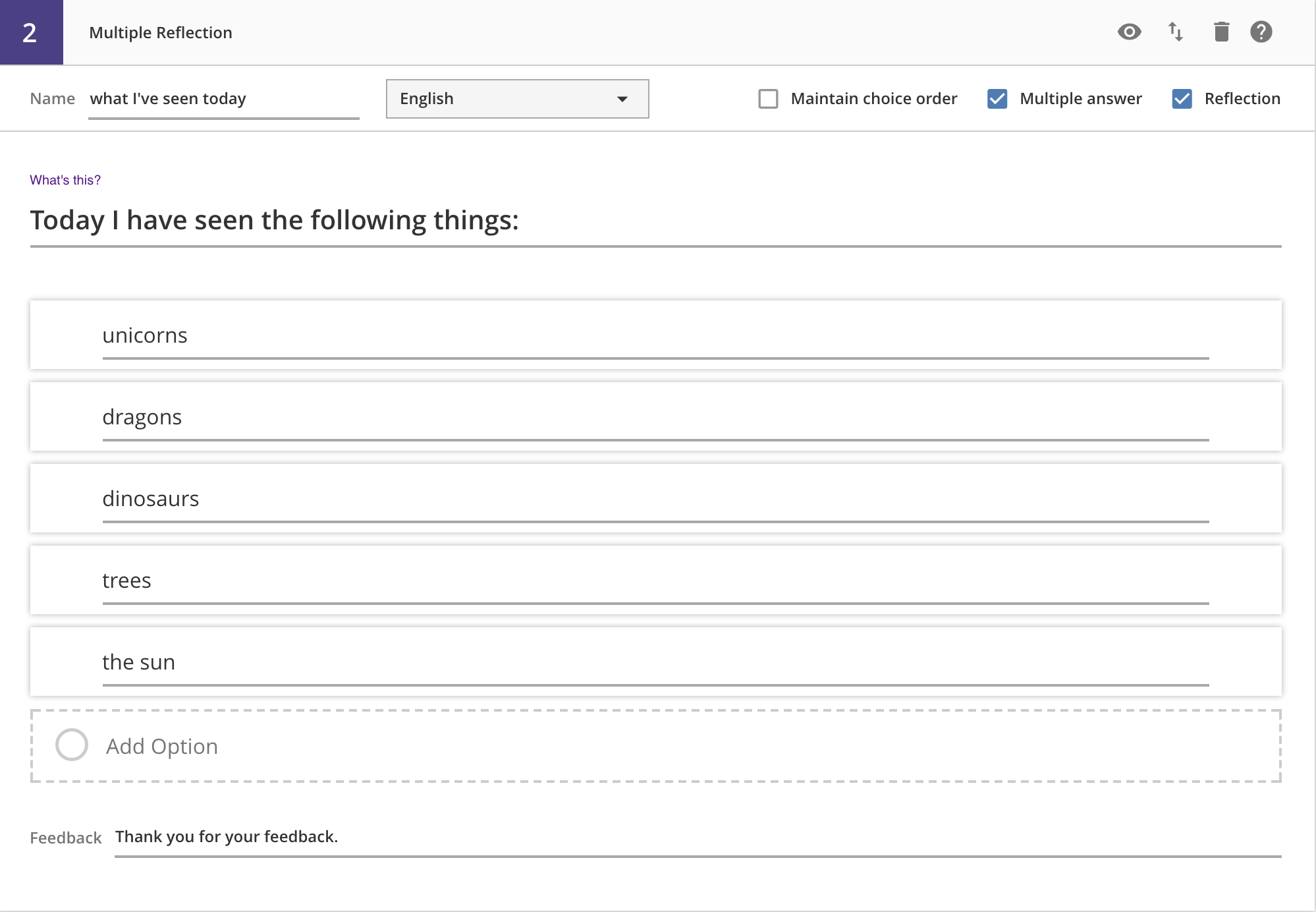
This question type presents a set of choices to the student, and they have to select one or more and submit them with no evaluation of correctness. This is typically used for a survey-type situation, i.e. What did you learn in this lesson?.
Author View
Student View
Other Authored Inputs
Each choice will appear as a separate option bar.
You can also delete the option with the X icon on the right.
Indicating Correctness
Since all submissions are acceptable, there is no way to indicate or evaluate correctness.
Providing Feedback
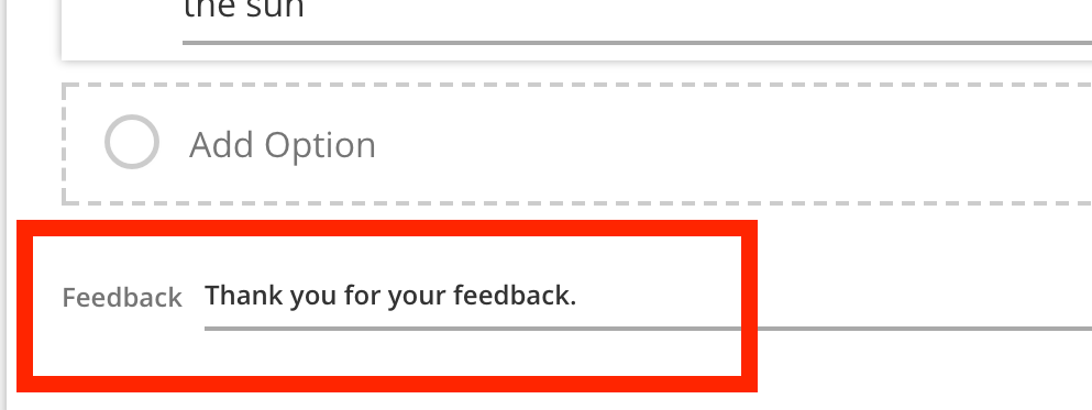
A single feedback field is at the bottom of the question, which is shown to the student upon submission of their response.
Multiple Choice -- Reflection
Description
This question type presents a set of choices to the student, and they have to select one and submit it with no evaluation of correctness. This is typically used for a survey-type situation, i.e. How easily did you understand this lesson?.
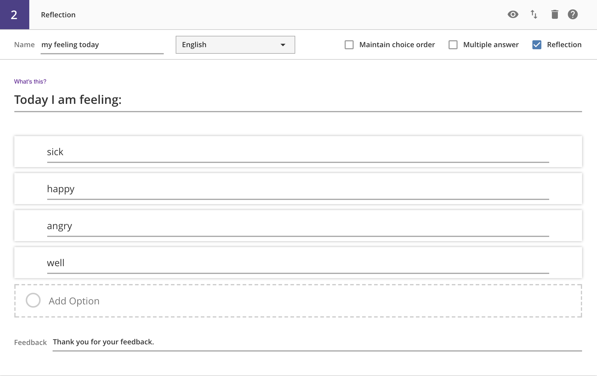
Author View
Student View
Other Authored Inputs
Each choice will appear as a separate option bar.
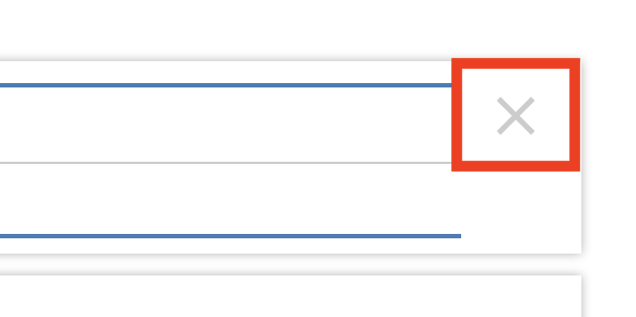
You can also delete the option with the X icon on the right.
Indicating Correctness
Since all submissions are acceptable, there is no way to indicate or evaluate correctness.
Providing Feedback
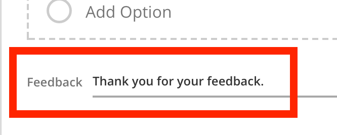
A single feedback field is at the bottom of the question, which is shown to the student upon submission of their response.
Short Answer
Description
This question type shows a text entry box to the student and accepts text input.
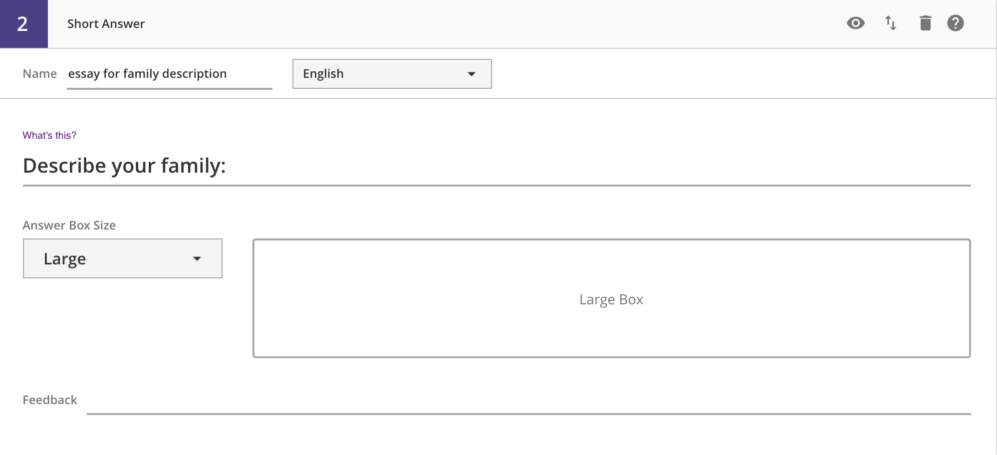
Author View
Student View
Other Authored Inputs
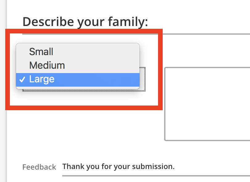
You can select the size of the displayed text box (small, medium, or large). While the assessment player does not enforce any text limitations, the box size is supposed to indicate to the student how much to type. For example, a small box will accept a couple of words, while a large box will accept a paragraph. So depending on what you are asking the students to type out, you can select an appropriately sized text entry box.
Indicating Correctness
All text entries are accepted, so there is no way to indicate correctness.
Providing Feedback
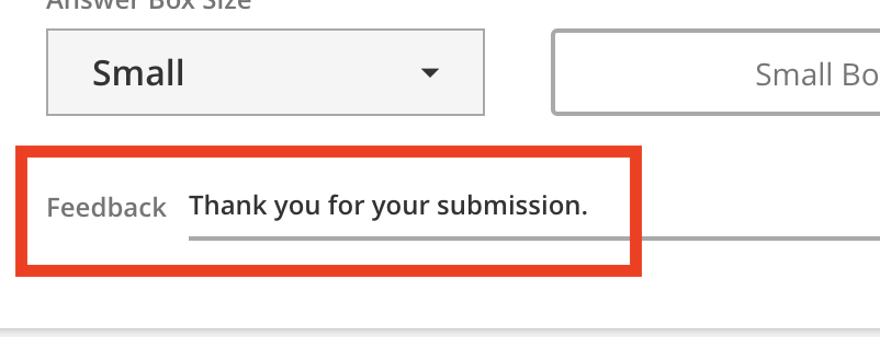
A single feedback field is provided at the bottom of the question. This is shown to the student upon submission of their response.
Publishing Workflow
Publishing
What Published Means
A published assessment means...
- It is ready for use by your students.
- You can generate an
iframecode to put into your gstudio activities, and students can interact with the questions you created. - You cannot edit the assessment.
- You can preview the assessment.
Previewing
To preview a published assessment, you can click on the assessment row's preview icon.
Note how there is a navigation bar at the top of the preview, allowing you to return to the list view:
Note that currently, you can only preview the English version of an assessment. If you have authored the assessment questions in another language, it will come up in gstudio, but not in the authoring preview. If you did not include English text, then the question text may appear blank, but other fields (like choices) may appear in the other language. This is because the preview tries to pull English text for all fields first, and question text always has a default empty English value.
From the Edit Assessment Page
In addition to publishing from the assessment list page, you can also publish an assessment from the edit assessment page, using the green Publish button in the upper-right.
From the List View Page
In addition to publishing from the edit assessment page, you can publish an assessment directly from the assessment list page by clicking on the "unpublished" icon in the middle of the row.
Unpublishing
What Unpublished Means
An unpublished assessment means...
- You cannot preview the assessment.
- You can edit the assessment and its questions.
- Any old
iframeembed codes that you put into agstudioactivity are NO LONGER VALID, and students WILL NOT be able to take the old assessments. You must re-publish the assessment and generate / update theiframecodes, if you want students to be able to take the new assessment.
From the List View Page
From the assessment list page, you can unpublish an assessment by clicking on the "published" icon in the middle of the row.

